Color plays a crucial role in the world of arts and television, particularly when it comes to enhancing fashion design. The use of color theory allows designers to create visually appealing and harmonious compositions that resonate with audiences. From selecting the right color palette for clothing collections to crafting captivating sets on television shows, understanding how colors interact and impact perception is essential.
For instance, consider a hypothetical scenario where a fashion designer aims to create a collection inspired by nature’s vibrant hues. By applying color theory principles, they can strategically combine warm tones like reds and oranges with cool tones such as blues and greens. This careful selection not only evokes a sense of balance but also draws attention to specific elements within their designs. Through an academic exploration of color theory in arts and television, this article delves into the ways in which designers utilize various aspects of color symbolism, psychology, and harmony to enhance fashion aesthetics and captivate viewers’ attention.
Understanding Color Theory
Color theory plays a crucial role in various fields, including arts and television. By understanding the principles of color harmony and contrast, designers can effectively communicate their ideas and evoke specific emotions in their audience. For example, imagine an art exhibition where vibrant reds and oranges are strategically used to create a sense of excitement and energy within the space. This deliberate use of color is not arbitrary; it stems from a deeper understanding of color theory.
To delve into color theory further, let us explore some fundamental concepts:
-
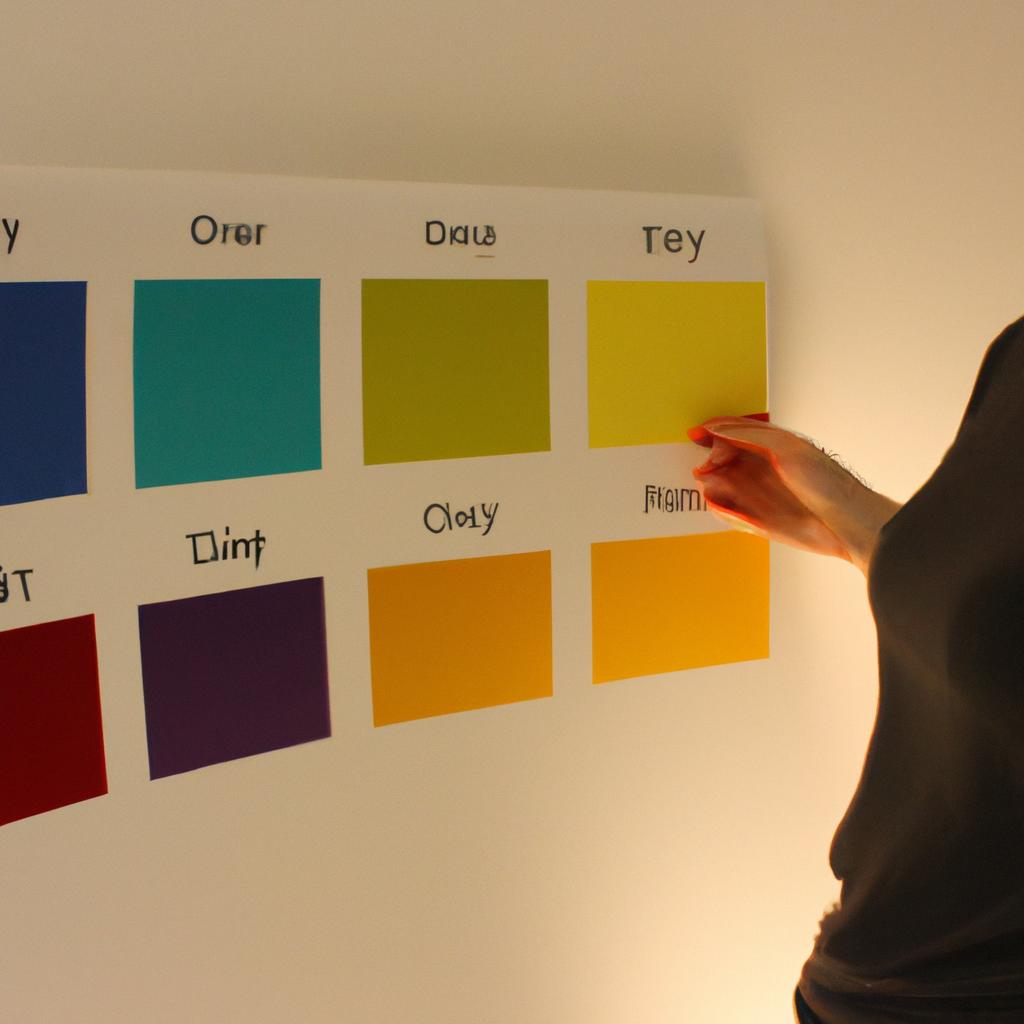
The Color Wheel: The color wheel is a visual representation of colors organized according to their relationship with one another. It consists of primary colors (red, blue, and yellow), secondary colors (orange, green, and purple), and tertiary colors (mixtures of primary and secondary). Understanding how these colors interact can help designers make informed choices when creating visuals.
-
Color Harmony: Achieving color harmony involves combining hues that work well together aesthetically. Complementary colors lie directly opposite each other on the color wheel (e.g., red and green) and create high contrast when placed side by side. Analogous colors are adjacent on the wheel (e.g., blue-green, green, yellow-green) and produce a more subtle blend.
-
Psychological Effects: Colors have psychological effects that can elicit emotional responses from viewers. Warm tones such as reds, oranges, and yellows tend to evoke feelings of warmth, energy, or passion. Cool tones like blues, greens, and purples often convey calmness or tranquility.
By incorporating these principles into their work, designers can enhance the impact of their creations by evoking desired emotional responses in viewers.
| Color | Emotional Response |
|---|---|
| Red | Passionate |
| Blue | Calm |
| Yellow | Energetic |
| Green | Balanced |
In summary, understanding color theory is essential for artists and designers to effectively communicate their ideas and create visually striking compositions. By utilizing the principles of color harmony and considering the psychological effects of different hues, professionals in these fields can evoke specific emotions within their audience.
Transitioning into the subsequent section about “The Role of Color in Fashion,” it becomes evident that color theory’s applications extend beyond art exhibitions or television sets. In the realm of fashion design, color plays a vital role in expressing individuality and creating captivating visual experiences.
The Role of Color in Fashion
Understanding Color Theory in the context of arts and television is crucial for fashion designers aiming to create visually appealing and impactful designs. By utilizing color effectively, designers can evoke emotions, convey messages, and enhance the overall aesthetic appeal of their creations. In this section, we will explore how an understanding of Color Theory can play a significant role in enhancing fashion design.
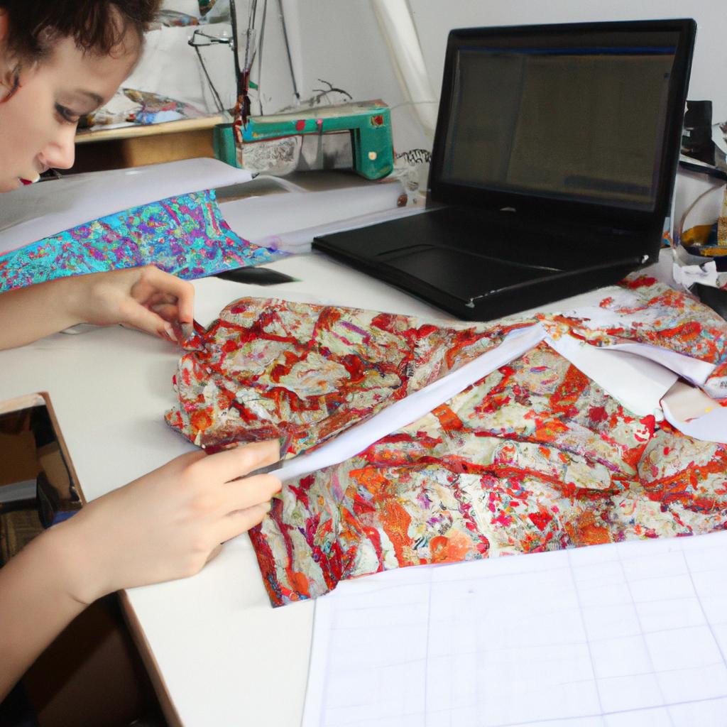
To illustrate the importance of Color Theory in fashion design, let’s consider a hypothetical example. Imagine a fashion designer who wants to create a collection inspired by nature. By carefully selecting colors based on their associations with different elements of nature – such as cool blues for water or vibrant greens for foliage – the designer can capture the essence of natural beauty through their garments. This exemplifies how color choices can greatly influence the visual impact and thematic coherence of a fashion collection.
When it comes to incorporating color theory into fashion design, there are several key considerations that designers should keep in mind:
- Color Harmony: Understanding how different colors interact with each other is essential for achieving pleasing combinations within a garment or ensemble.
- Color Symbolism: Colors often carry symbolic meanings across cultures and societies. Designers must be aware of these associations to ensure that their use of color aligns with the intended message or theme.
- Color Psychology: Different colors elicit various emotional responses in individuals. By strategically using certain colors in specific contexts, designers can create distinct moods or atmospheres within their designs.
- Color Contrast: Utilizing contrast between colors – whether it be through differences in hue, value, or saturation – adds visual interest and helps highlight focal points within a design.
| Hue | Value | Saturation | |
|---|---|---|---|
| 1 | Exciting | Bright | Intense |
| 2 | Soothing | Dark | Muted |
| 3 | Stimulating | Light | Vibrant |
| 4 | Harmonious | Neutral | Subtle |
This table provides a summary of the emotional responses that different color attributes can evoke in individuals. By understanding these associations, fashion designers can strategically utilize colors to elicit specific emotions and enhance the overall impact of their designs.
Incorporating an understanding of Color Theory is vital for fashion designers seeking to create visually captivating and emotionally resonant designs. By considering color harmony, symbolism, psychology, and contrast, designers can effectively communicate their artistic vision through their creations.
Transitioning seamlessly into our exploration of Color Psychology in Design, let us now turn our attention to how colors affect human perception beyond visual aesthetics alone.
Color Psychology in Design
As established in the previous section, color plays a significant role in fashion design. It has the power to evoke emotions, create visual interest, and convey messages. Now, let us delve deeper into how color theory is applied in both arts and television to enhance fashion design.
To illustrate this concept, imagine a hypothetical scenario where a fashion designer is creating a collection inspired by nature. The designer carefully selects colors that reflect the vibrancy and tranquility found in natural landscapes. By using earthy tones such as moss green and warm browns, combined with pops of vibrant floral hues like coral and lavender, the designer successfully captures the essence of nature within their garments.
Color psychology also influences the decisions made by designers when choosing color schemes for their collections. Understanding which colors elicit specific emotional responses allows designers to connect with their target audience on a deeper level. For instance:
- Soft pastel shades can evoke feelings of innocence and serenity.
- Bold primary colors can communicate confidence and energy.
- Earth tones can invoke a sense of grounding and stability.
- Jewel tones can exude luxury and elegance.
In addition to these psychological effects, color harmonies are crucial in creating visually appealing designs. Designers often utilize various color combinations based on established principles such as complementary or analogous color schemes. A three-column table showcasing different harmonies could be implemented here for better visual representation:
| Complementary Colors | Analogous Colors | Monochromatic Colors |
|---|---|---|
| Red & Green | Blue & Purple | Shades of Blue |
| Yellow & Purple | Orange & Pink | Shades of Gray |
| Blue & Orange | Green & Yellow | Shades of Brown |
By employing these techniques, designers not only enhance the aesthetic appeal but also ensure that their creations resonate emotionally with viewers. This connection between artistry, television presentation, and our perception of color strengthens the impact of fashion design as a visual medium.
Moving forward, let us delve into the concept of color harmonies in art and fashion, exploring how different combinations can further enhance the overall appeal of designs.
Color Harmonies in Art and Fashion
The Influence of Color Psychology on Fashion Design
Color psychology plays a significant role in the world of fashion design, as designers strategically select color palettes to evoke specific emotions and enhance their creations. For instance, consider a hypothetical scenario where a designer is creating a collection for an upcoming spring/summer season. By incorporating vibrant colors such as coral, lemon yellow, and sky blue, the designer aims to evoke feelings of joy, freshness, and optimism among potential consumers.
To further understand the impact of color psychology on fashion design, let us explore some key factors that influence consumer perceptions and emotional responses:
- Warm vs Cool Colors: Warm colors like reds, oranges, and yellows are associated with energy, excitement, and passion. On the other hand, cool colors such as blues, greens, and purples elicit calmness, serenity, and relaxation.
- Contrasting Combinations: The use of contrasting colors can create visual interest and draw attention to specific elements within a garment or ensemble. This technique often involves pairing complementary hues (opposites on the color wheel) or utilizing triadic harmonies (three equally spaced colors).
- Monochromatic Schemes: Monochromatic schemes revolve around variations of a single color. They provide an elegant and sophisticated look while allowing subtle nuances in shade or intensity to add depth to the overall design.
- The Power of Neutrals: Neutral tones such as black, white, gray, and beige serve as foundational elements in fashion design. They act as versatile canvases upon which more vibrant shades can be highlighted or balanced against.
Taking these considerations into account when designing a collection enables creators to effectively communicate desired emotions through their work. By thoughtfully selecting appropriate color combinations based on psychological principles, designers can greatly enhance their ability to connect with audiences on an emotional level.
Emotional Response Bullet Points:
- Vibrant colors evoke feelings of joy, freshness, and optimism.
- Warm colors elicit energy, excitement, and passion.
- Cool colors create a sense of calmness, serenity, and relaxation.
- Contrasting combinations add visual interest and draw attention.
| Warm Colors | Cool Colors | Monochromatic Schemes | The Power of Neutrals |
|---|---|---|---|
| Energy | Calmness | Elegance | Versatility |
| Excitement | Serenity | Sophistication | Balance |
| Passion | Relaxation | Depth | Adaptability |
Exploring Color Harmonies in Art and Fashion
In addition to color psychology, the concept of color harmonies plays a vital role in both art and fashion. Artists have long utilized various harmony techniques to create visually appealing compositions that exhibit balance and unity. Similarly, fashion designers employ these principles to ensure their collections are aesthetically pleasing.
One common form of color harmony is the analogous scheme, where adjacent hues on the color wheel are used together. For example, pairing shades like red-orange, orange, and yellow-orange creates an analogous color palette that offers a cohesive look while allowing for subtle variations.
Another popular technique is the complementary scheme which involves using colors that sit opposite each other on the color wheel. This contrast creates vibrancy and grabs attention when incorporated into fashion designs or artworks.
Lastly, triadic harmonies involve selecting three equally spaced colors on the color wheel. The resulting combination provides a balanced yet dynamic effect that can be quite striking when applied thoughtfully in design.
By understanding different types of color harmonies and their impact on aesthetics, fashion designers can effectively harness these techniques to elevate their creations beyond mere garments into works of art that captivate viewers’ attention.
With a solid understanding of color psychology and the principles of color harmonies in place, we can now explore how these concepts are translated into color trends within both television and fashion industries.
Color Trends in Television and Fashion
Following the exploration of color harmonies in art and fashion, it is now imperative to delve into the fascinating realm of color trends. Understanding how colors are utilized in both television and fashion can provide valuable insights for enhancing fashion design. For instance, let us consider a hypothetical case study of a popular TV series known for its distinctive visual aesthetic.
In this series, the production team carefully selected a specific color palette to evoke different emotions and enhance storytelling. The main character’s wardrobe consistently featured shades of blue, symbolizing stability and trustworthiness, while supporting characters were often dressed in vibrant reds or yellows to convey energy and excitement. By strategically employing these colors, the show successfully created an immersive viewing experience that resonated with audiences on a subconscious level.
To further expand our understanding of color trends in television and fashion, we can examine some key factors that contribute to their influence:
- Cultural Context: Colors hold various meanings across different cultures. Incorporating culturally significant hues into television shows or fashion collections can create connections with specific target audiences.
- Seasonal Adaptation: Both television shows and fashion brands adapt their color choices according to seasonal changes. Warm tones may dominate during summer months, while cool hues find prominence in winter-themed episodes or collections.
- Influencer Marketing: Collaboration between influential figures from the entertainment industry and top designers leads to the emergence of new color trends that quickly gain popularity among consumers.
- Social Movements: Color choices within television programming or fashion campaigns often reflect contemporary social issues such as sustainability or inclusivity, serving as powerful tools for advocacy.
By considering these factors when creating designs, aspiring fashion designers can harness the power of color trends seen not only on-screen but also on runways around the world.
Now transitioning into exploring color palettes in fashion design…
Exploring Color Palettes in Fashion Design
The impact of color psychology on fashion design cannot be understated. By understanding how colors evoke emotions and influence perceptions, designers can effectively communicate their vision and create garments that resonate with their target audience. This section delves into the fascinating world of color psychology in fashion design, exploring its application and significance.
To illustrate the power of color psychology in fashion design, let’s consider a hypothetical case study. Imagine a renowned designer who wants to create a collection inspired by tranquility and relaxation. In this scenario, the designer would likely incorporate cool tones such as blues and greens which are known for their calming effect. These colors could be used strategically to convey a sense of peace and serenity throughout the collection.
- Warm colors like reds and oranges evoke feelings of passion and excitement.
- Cool colors like blues and purples inspire calmness and tranquility.
- Bright hues such as yellows and pinks elicit energy and optimism.
- Neutral shades like grays and browns exude sophistication and elegance.
Furthermore, designers often utilize different combinations of colors to achieve desired effects. The table below showcases some common color palettes used in fashion design along with their associated emotional responses:
| Palette | Emotional Response |
|---|---|
| Monochromatic | Harmony |
| Analogous | Coziness |
| Complementary | Contrast |
| Triadic | Vibrancy |
By carefully selecting appropriate palettes based on the emotions they wish to evoke, designers can curate visual experiences that align with their creative vision.
In conclusion, exploring color psychology is an essential aspect of successful fashion design. Through strategic use of colors, designers have the ability to tap into viewers’ emotions, creating powerful connections between their collections and their audience. By employing various color palettes and considering the associated emotional responses, designers can craft garments that not only showcase their creativity but also resonate with individuals on a deeper level. The next section will delve further into the practical application of color theory in fashion design.

